
Eric Carle Museum of Picture Book Art
Four week-long sprints
Logo design, mockups, prototyping, style guide
Sketch, Illustrator, InVision
UI Designer
Alexandra Kennedy, the Executive Director of the museum, approached Designation with a design problem. Our task was to redesign a website for the Eric Carle Museum.
The Eric Carle Museum of Picture book art is a non-profit organization in Amherst, MA. Their mission is to inspire a love of art and reading through picture books. The Eric Carle Museum is a leading advocate for visual literacy in educational pedagogy.
My design team was tasked with developing an updated website aesthetic that would speak to the Carle's current and potential audiences.
We were given UX research, personas, and mid-fidelity wireframes from the previous cohort’s UX team. The UX team designed a portal that houses the educational material that the museum has and which can be used by educators. They called it “Carle’s Web”.
Andrea Powers, Director of Finance and Administration, mentioned in the SME interview that a common misconception is that the Carle is a children’s museum, however, this is inconsistent with their actual identity.
The Carle is not just a children’s museum, but, as she puts it, “an art museum that welcomes children.”
Below are the persona and problem statement we received from the UX team.
Persona:
Katherine is a progressive educator and mother of two young children.
Katerine:
“Picture books are about more than just entertainment, they are a way to teach our children to be better people.”
Problem Statement
The Carle is seen as an expert in experiential education methods that foster creative critical thinking skills and a personal connection to the world of art. The progressive educator needs online access to the Carle’s picture book inspired activities. Because in a world of “cute” product-based crafts, it’s hard for her to find substantive, process-driven activities for her lessons.
We began our work by creating UI design principles to guide our research and designs. They were based on the client goals, the problem statement from UX team, and Katherine's needs and frustrations.
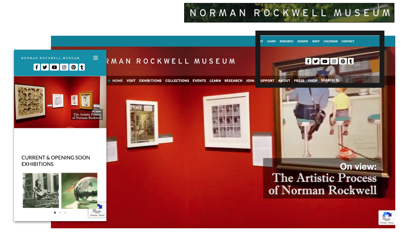
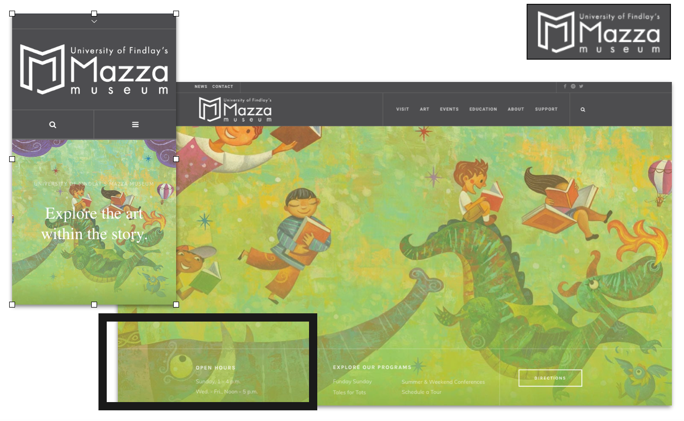
After gaining an understanding of the domain, The next step was to research relevant competitors to gain an understanding of common UI patterns. We began with art museums’ websites because stakeholders wanted the Carle’s website to have a professional art museum style. Also, we checked educational websites like Scholastic Corporation to help us understand how to approach the educational part of the website (filter options, books cards, etc).
We noticed some UI patterns that we was going to use in our design directions.
After conducting our competitive analysis, I evaluated the wireframes we received from the UX team and went through the results from the usability testing they performed on these wireframes. I made some changes based on my findings.
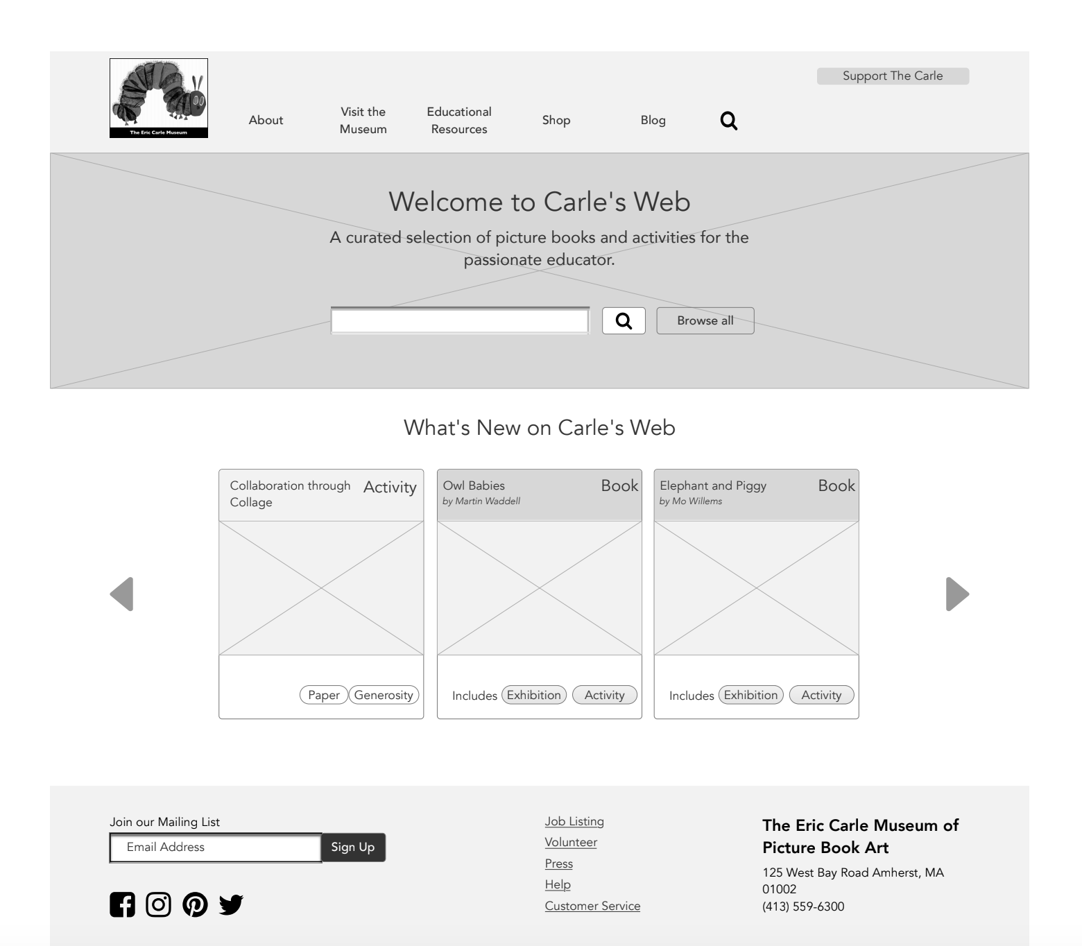
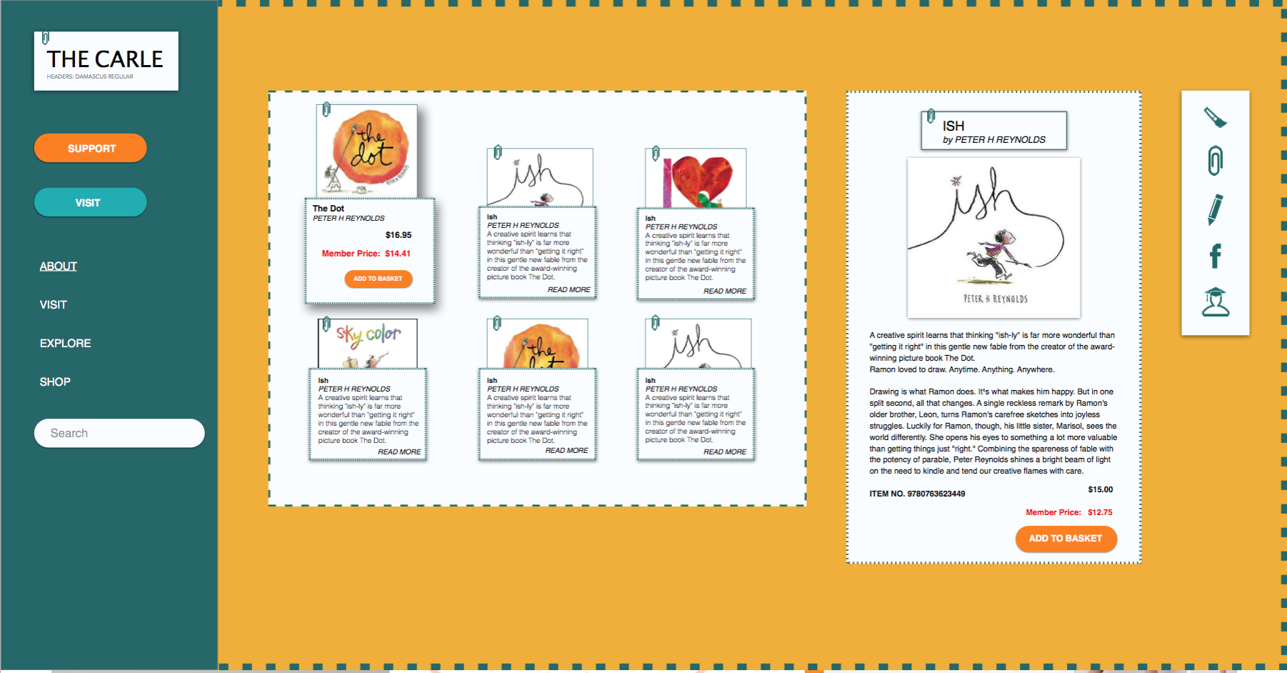
Carle’s Web is intended to be a resource for educators to find substantial craft and art activities for lesson planning.
Unfortunately, the name “Carle’s Web” was a bit confusing to users because the name did not make it clear that this was an educational portal.
To alleviate this confusion, I changed it to “Carle’s Lesson Planner.” I also put a link to “Carle’s Lesson Planner” in the top menu to make it easy to find.
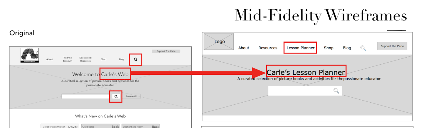
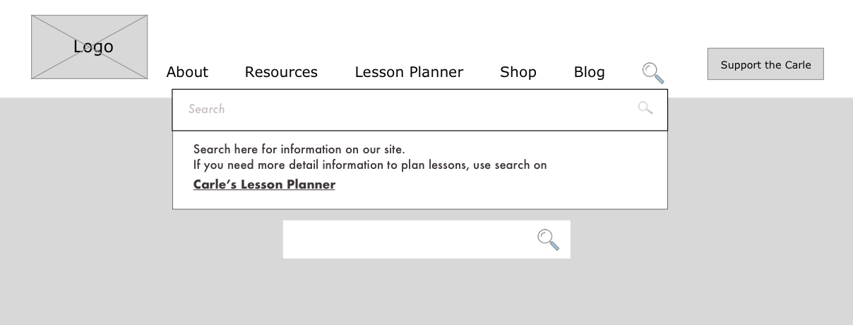
The next problem was that there were two search bars on the site, one for searching the whole site and another for searching within only “Carle’s Web”. Users were confused which one to use. To address this issue, I added a drop down dialog with an explanation to prime users to each search bar’s function.
Keeping in mind our design principles and persona, I created three divergent style directions to test with users.
In my style tiles I wanted to find a nice balance of our design principles. For example, in the first one I used the bauhaus style. It is ageless and also its graphic and geometric shapes allow other imagery to really pop (speaking to our design principle of complementary) which I show in this style tile like frames for the artworks.
This style connected to our persona. She was playful, felt young at heart, and loved crafts. Therefore, I chose these complementary and bright colors plus overlapping elements, with organic shapes and texture to appeal to her interest in crafting.
Katherine is a very socially active person. She communicated a lot with friends and other moms. I played on the idea of communication and connection in this style tile.
I chose green color because it’s the color of spring, when everything begins to grow, just as children do.
Next we did desirability testing to test the design directions with people who were similar to Katherine. We had 4 participants. My teammate and I showed our style tiles in a random order, asking open-ended questions like “What is the first thing you see?” Additionally, we tried to evaluate how much the style tiles adhere to the design principles by asking each participant to rate our style tiles with the following prompt: “How Trustworthy, Ageless, and Complementary would you rate the following style tiles on a scale of 1 to 5?”.
Of my designs, “Bauhause” received the most positive feedback overall. It was rated as more ageless, trustworthy and complementary by users. So I decided to move forward with this tile.
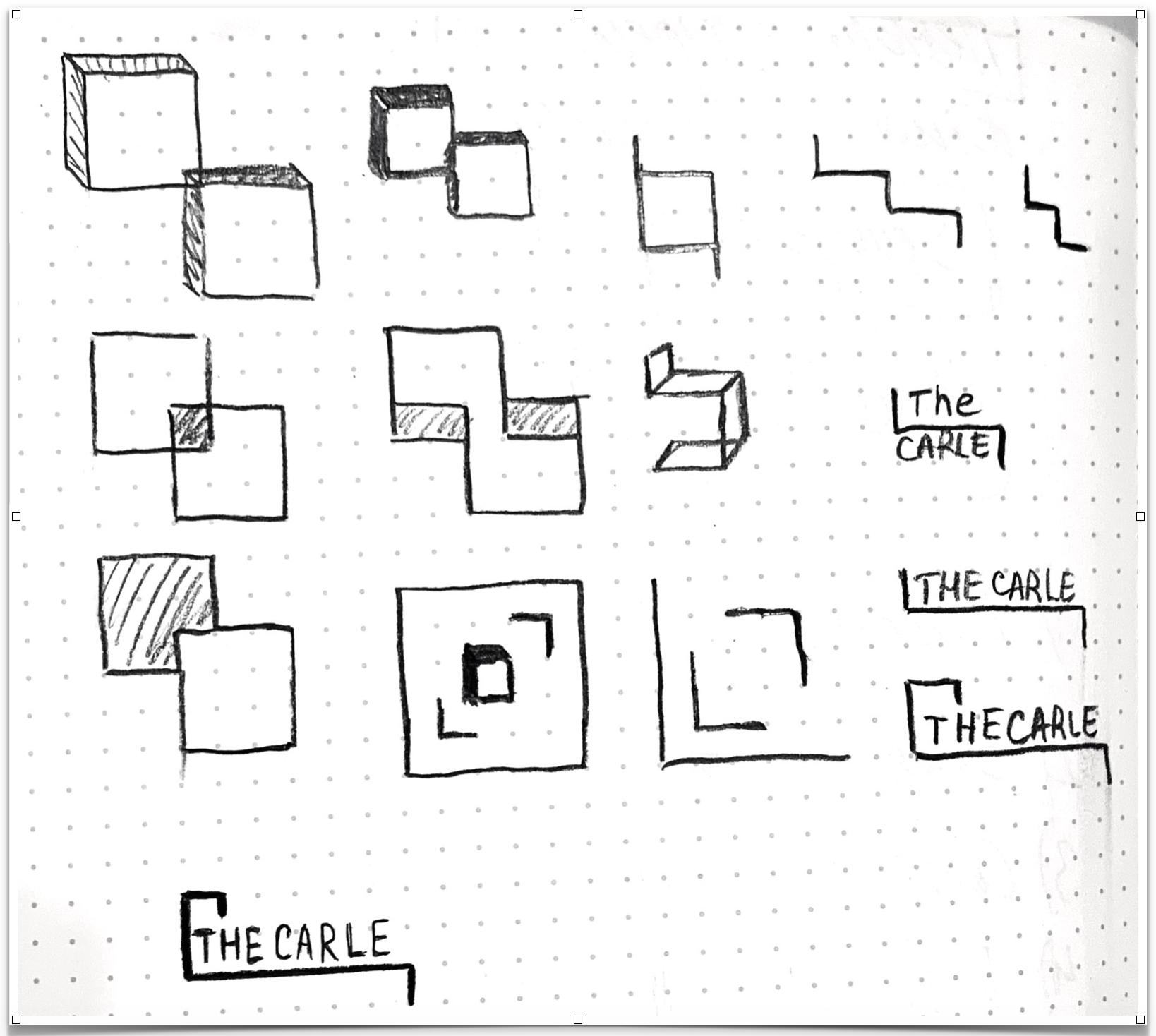
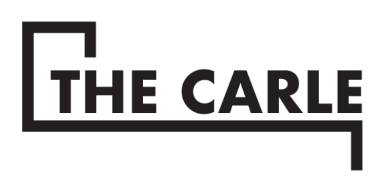
Visual redesign I began with creating online logo.
The current logo is beautiful and features the art of three beloved illustrators. However, our client, Alexandra, expressed some frustrations with the limitations of its current dimensions. the logo is vertical, and doesn’t scale well to smaller sizes since the text becomes illegible. I found that there was an opportunity here to design a wordmark logo that could be adopted across a variety of mediums in conjunction with the original vertical logo.
Since the current logo is so ubiquitous with the museum’s identity, I wanted to make sure that the wordmark I developed would not compete with the existing logo.
This spoke directly to our design principle of “Complementary” and served as an anchor for my exploration.
The sketches I show below began from the museum building. I drew elements like stairs, picture frames, windows. Then I began to combine them. I wanted the logo to be simple to show how easy it is to use the website.
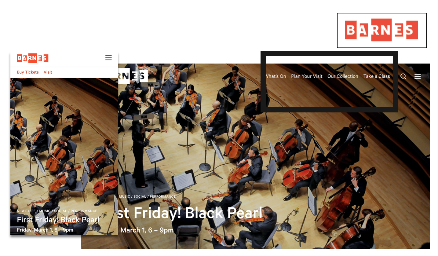
To bring my project together, I designed high fidelity mockups for “Carle’s Lesson Planner” and the museum homepage.
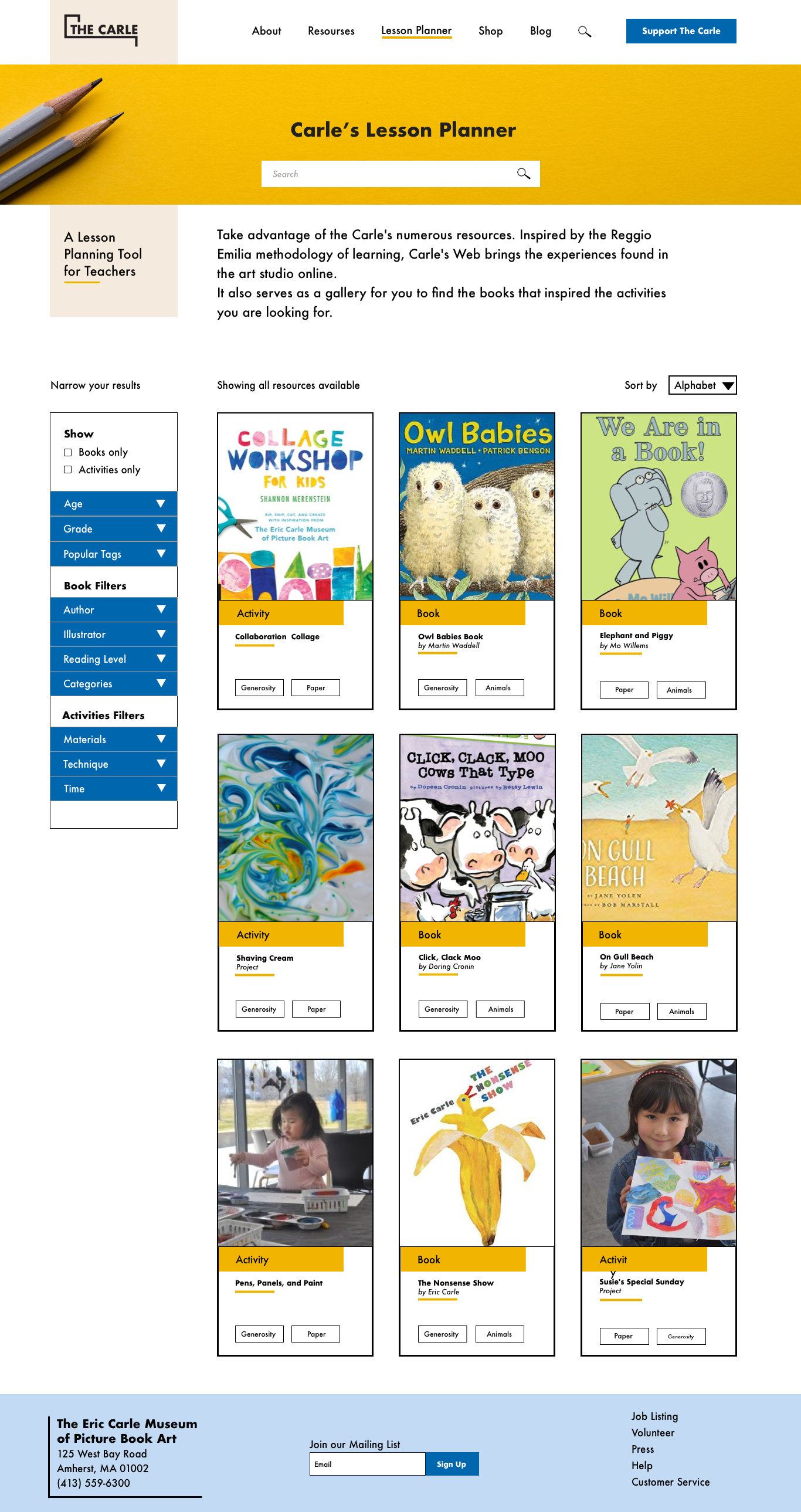
I wanted The Carles Lesson Planner page to look different from other parts of the site.
I put a yellow banner with a search bar for the Lesson Planner that makes the name and search bar very prominent for users. Also I created a different style for cards with books and activities.
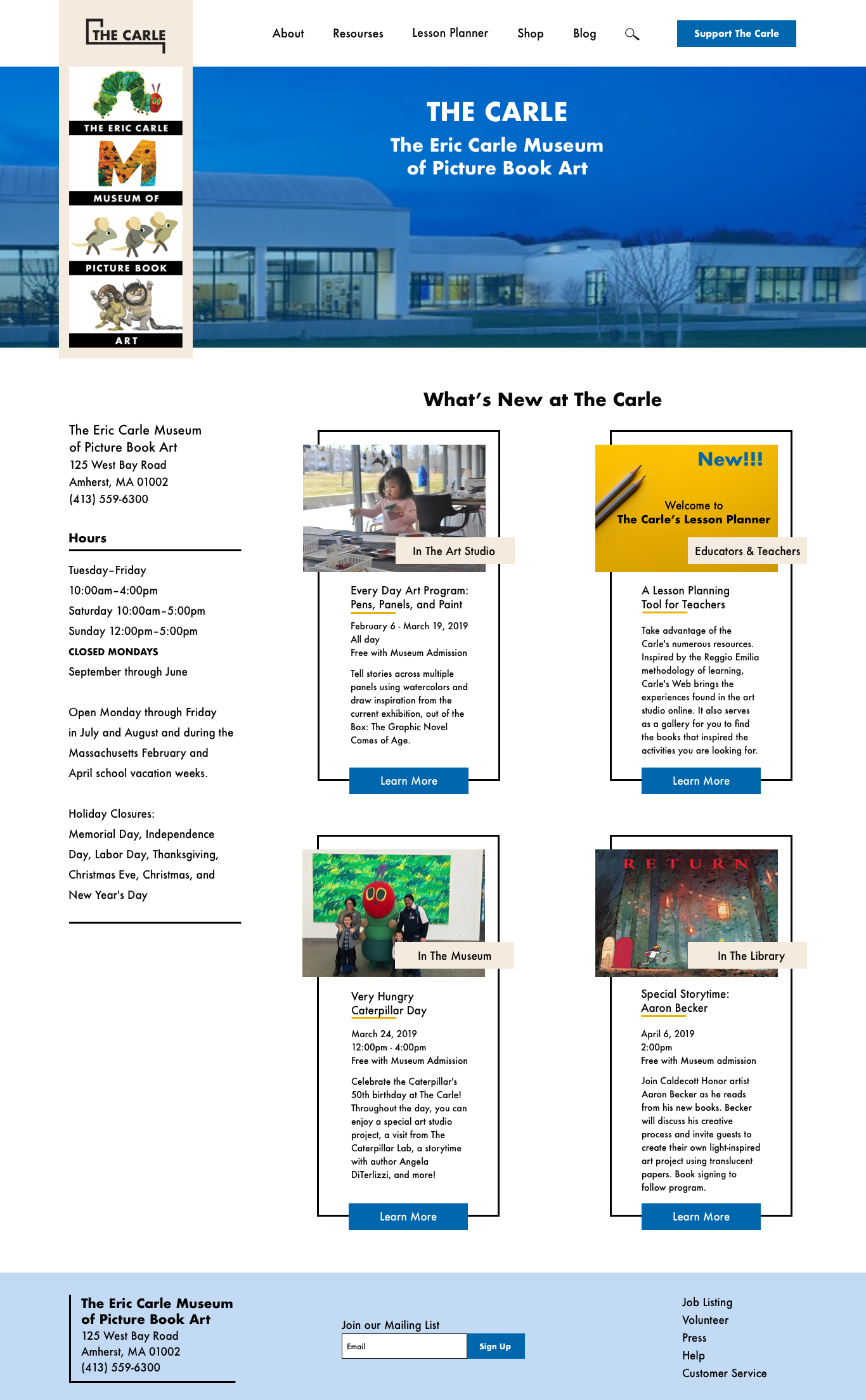
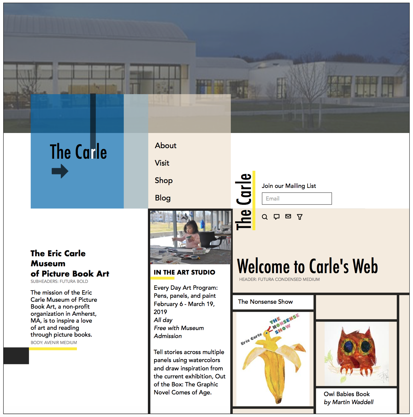
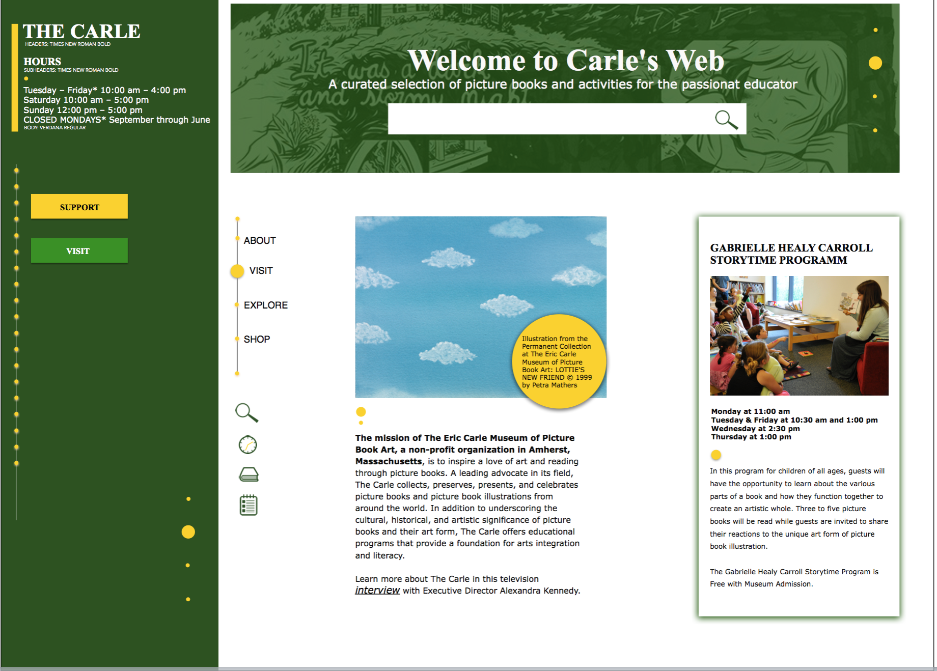
The home page has a hero image with the pic of the museum. It can be carousel with different museum images or video.
Also I put the current famous museum logo on the homepage that makes obvious that it is the Eric Carle museum website. The new Carle’s web logo I put under the current logo, and it stays fixed on the top when the user scrolls.
Additionally, the important information (address and hours) is easily accessible.
It was exciting work, and my final solution, especially after usability testing, made me happy.
I also made the Style Guide to create a comprehensive list of UI elements and how they should be used in my design. Click here for the Style Guide.
I further developed my design into an interactive prototype on InVision Link to Prototype. To validate our design decisions, my team performed three usability testing sessions with our prototypes for The Carle Museum website redesign and the Carle’s Web lesson planning product. We wanted to find any pain points in our key user task flow and scenario and evaluate the effectiveness of the web screen layouts - are they easy for users to understand?
All my changes in the UX concept (name, location, and search bar drop down menu) were successful.
All users were able to complete all the tasks successfully and very quickly.
In general, users described the prototypes as “clear” and easy to understand.
The two teachers expressed that they found these resources more intuitive than other online planners they had accessed in the past.
Participants had questions about what the tags were, or how they would function. Future iterations should build out the tag system more for usability testing to determine what copy is more effective and clear
Photography of events within the museum had a positive impact on users’ opinions of my design. For this reason, a section that addresses the photography used throughout the site should be added to the style guide to make sure imagery used on the website is equally impactful and unified.
One participant noted that while looking for lesson plans, teachers are often thinking about how they meet teaching standards (in specific, Common Core standards). Future iterations could consider adding in a label to denote how an activity aligns with Common Core standards for art and reading.
Storytelling - doing presentations during these sprints, I learned how to present the story of my work for stakeholders using Keynote.
User testing - this project gave me my first opportunity to conduct and provide user testing sessions with actual users.
Overall, it was a great project where I refined my design skills, not only in the visual realm, but also the user experience side of design through my exploration of user testing and research-backed decision making.